Power BI Visuals are graphical representations of data that aid in better understanding, interpretation, and analysis. These visual elements are powerful tools that bring data to life, enabling users to discern patterns, trends, and correlations effectively.
For reference, all the Power BI visuals used in this article were built using the Power Template features, allowing for an effortless build/design process whilst ensuring we met design best practice standards.
What We Will Cover:
Throughout this article, we will explore innovative Power BI visuals that go beyond standard charts and graphs. From custom charts handling value changes over periods to dynamic image charts with data bars, each section will delve into specific techniques to enhance your data storytelling and analysis.
Why You Need Innovative Power BI Visuals:
- Enhanced Interpretation: When it comes to data interpretation, advanced visualizations provide a level of detail that traditional methods often miss. Say goodbye to the clunky, outdated tile slicer and hello to a sleek, flexible slicer that will help you uncover insights and make data-driven decisions faster than ever.
- Improved Engagement: Visualizations not only efficiently convey information but also have the power to captivate your audience. From dynamic charts to interactive dashboards, these visual elements make data interpretation engaging and memorable. By presenting information in a visually appealing manner, businesses can ensure that key insights are not only understood but retained.
Now, let’s dive into the details of each visual, accompanied by Key Performance Indicators (KPIs) to further elevate your data analysis and reporting capabilities.
1. Mastering Custom Charts: Handling Value Changes Between Two Periods
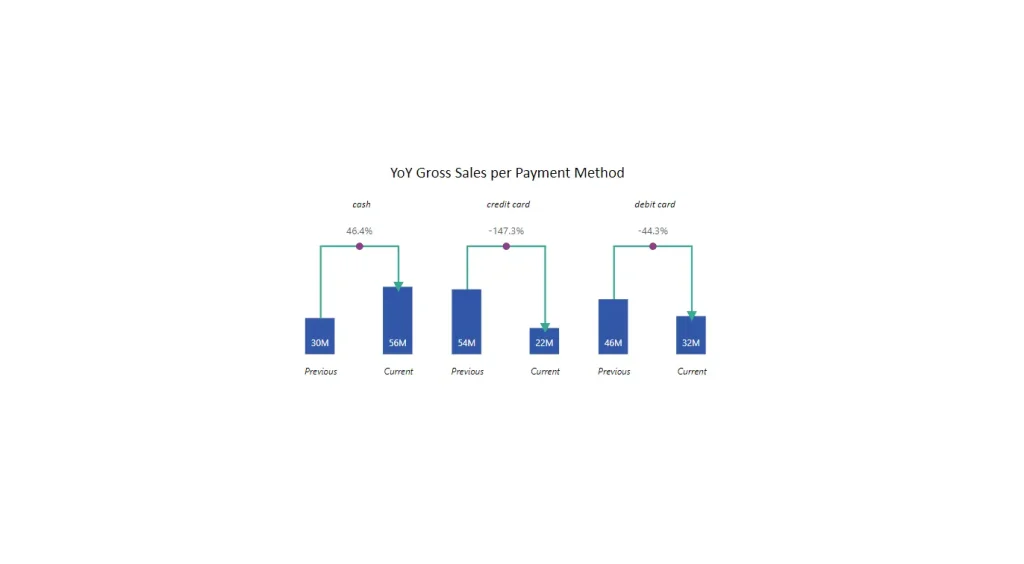
Compares current year vs previous year and displays the percentage change with conditional formatting, all dynamic according to the filters applied. A single chart using dax and native visuals to arrive at the final result.
In addition to tracking trends, introduce Key Performance Indicators (KPIs) such as:
- Period-over-Period Growth Rate
- Cumulative Value Change
These KPIs provide a holistic view, allowing you to assess the impact of changes over time.
2. Progress Bars in Tables: Visualizing Project Progress with Precision
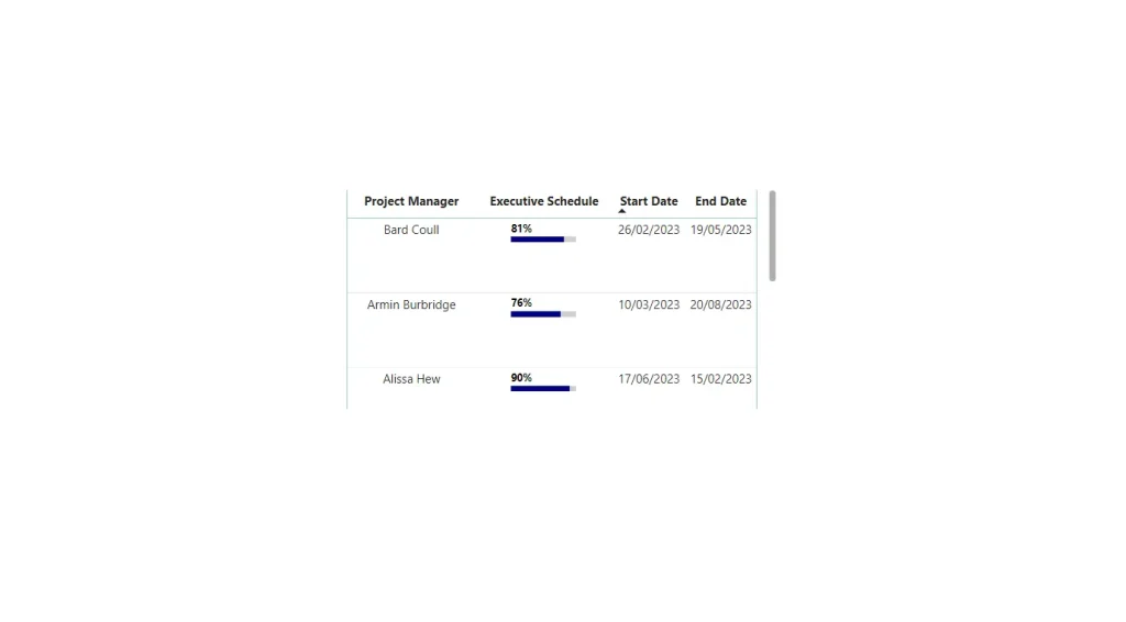
Transform your project management experience in Power BI by incorporating progress bars directly into tables. We are using DAX to create a SVG bar to arrive at the final result.
Alongside visualizing project progress, integrate KPIs like:
- Project Milestone Achievement
- Task Completion Rate
These KPIs provide real-time insights into project advancements, facilitating informed decision-making.
3. Dynamic Image Charts: New Slicer Visual with Data Bars

New Slicer Visual in Power BI allows various modifications, enabling users to create more dynamic and visually appealing reports. Alongside this visual has the capability of comparing actual values with maximum thresholds, introduce KPIs such as:
- Data Variance Percentage
- Goal Attainment Ratio
The new slicer provides more options compared to the default slicer, especially in terms of color customization and functionality.
4. SVG Lollipop Sparklines: Unveiling the Power of New Card Visuals
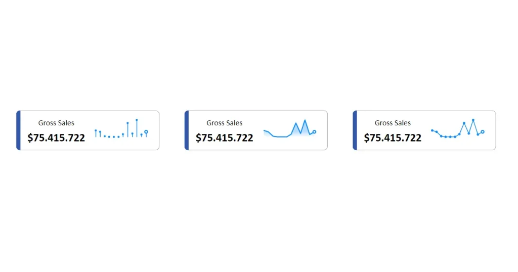
Explore the versatility of Power BI’s New Card Visuals building them out now using SVG measures. In addition to observing and comparing trends swiftly, introduce KPIs like:
- Sparkline Momentum
- Year-to-Date Growth
These KPIs provide a snapshot of performance, aiding in quick and insightful trend analysis.
5. Native Variation Arrow Bar Chart: Impactful Insights with Power BI
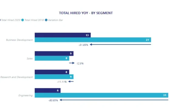
Discover the simplicity and effectiveness of a bar chart with a variation arrow, utilizing only native visuals within Power BI. In addition to conveying variations in data trends, integrate KPIs such as:
- Average Variation Magnitude
- Quarterly Performance Delta
These KPIs offer a quantitative measure, enhancing the clarity of your data insights.
Visuals in Action
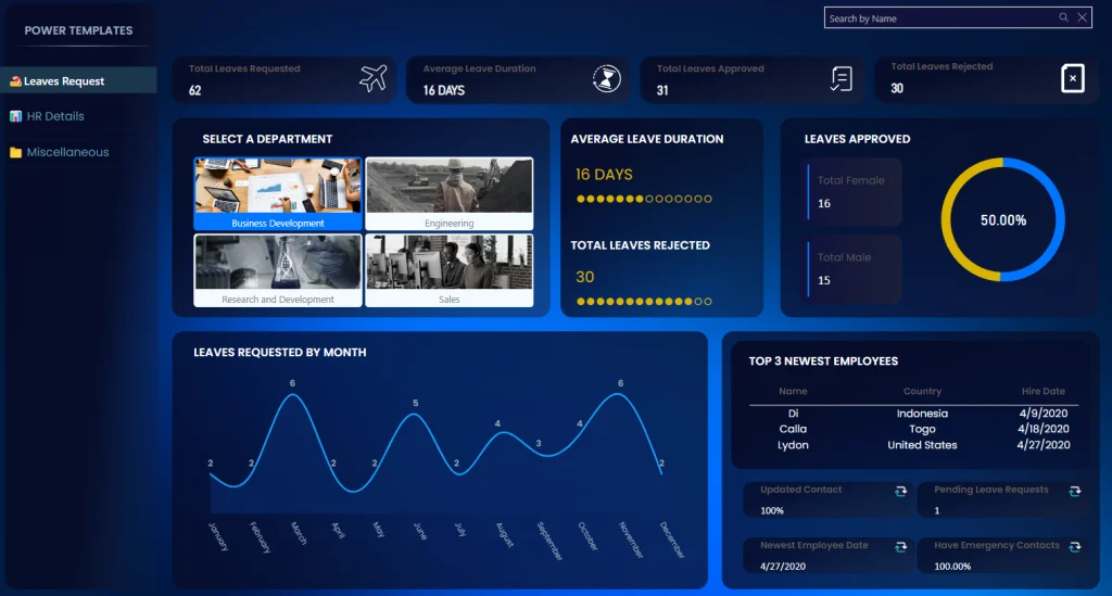
Reports, whether for business or academic purposes, often present complex information. To make this information more digestible, visuals play a crucial role in aiding comprehension and decision-making. Let’s explore how you can leverage visuals to build impactful reports and gain new insights.
See the below template for how you can apply different visuals to create powerful insights.
Conclusion
Innovative Power BI visuals is a game-changer for anyone seeking to derive meaningful insights from their data. Now you can learn a few different ways to customize your visualization titles, backgrounds, labels, and legends.
